According to the law of proximity, related objects should be grouped together. In typography, this in particular applies to body of text and its header: a header should be placed closer to the text that follows it than to the text that precedes it.
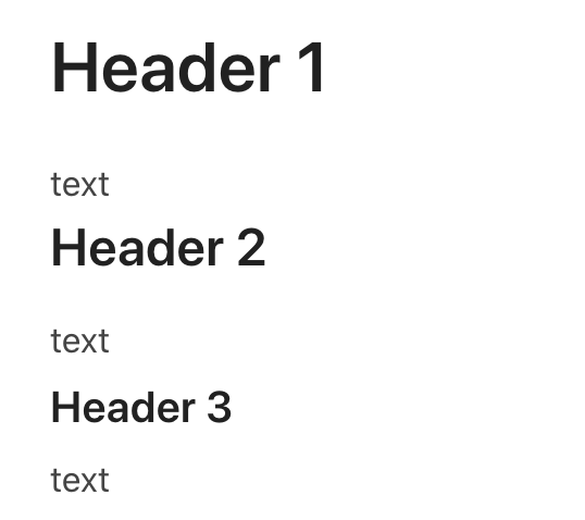
This is how Confluence renders headers with body. Note that there are no manually typed blank lines here.

Same text, but in Coda. Please note how the body text appears closer to the following header than to the preceding one, which makes it harder to scan and read the text.