Suggestion: Make tab width smaller
- It looks ugly and unreadable.
- It should be like 3-4 spaces.
- Actually made me stop using Coda.
- Hard to notetake when it hurts my eyes.
- Switched to markdown bc i can customize .css .
See: dropbox’s paper. or Notion
Difficulty: Low
Value: High
Hi @Anthony_Flores, thanks for the feedback!
Do you find the current spacing poor for indented bullets/numbering, indented paragraphs without bullets/numbering, or both?
Do you mind sharing a screenshot of some content you find hard to read?
Thanks!
Nathan
1 Like
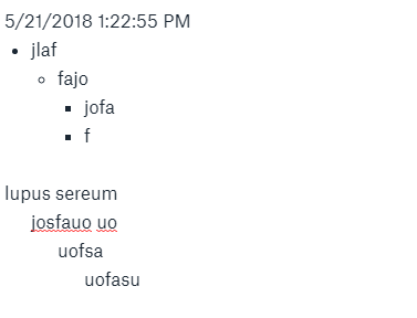
This is what it should ideally look like (taken from Dropbox Paper):
Yeah both bullets/numbering and paragraph would be good.
idk…it’s like how they say Python is “great” bc it uses 4 spaces–Makes it easy to scan w/ your eyes.
In the meantime, here’s a style-sheet for those who don’t want to wait.:
CSS available on website, when you click “edit”
Community post: Coda.io Better Indented Lists (Stylish - userstyle stylesheet)


