Launched: Duplicate page name support, @-mention pages and more mention improvements

We’ve loved hearing that your docs are taking new shape and that you’re feeling more freedom as you make since our pages launch a month ago. Today, I’m excited to share a bundle of updates to give you even more flexibility with pages, and to reference and navigate them more quickly.

Support for Duplicate Page Names

We’ve heard your feedback, and have been working to make this possible for you for a while. Starting today, pages and subpages within a doc can share the same name.

We’ve also updated the formula builder so that when you reference pages in your formulas, you’ll see more details about the page, including its icon.

Tip: Take advantage of unique page icons so that you can still differentiate your pages when linking and referencing them in your docs!

Updates to @-mentions

We’ve expanded the capability of @-mentions in your docs to let you reference (and link to) people, pages, tables and rows all with the ‘@’ symbol. We’ve also made performance improves to make the @-mention builder faster for you.
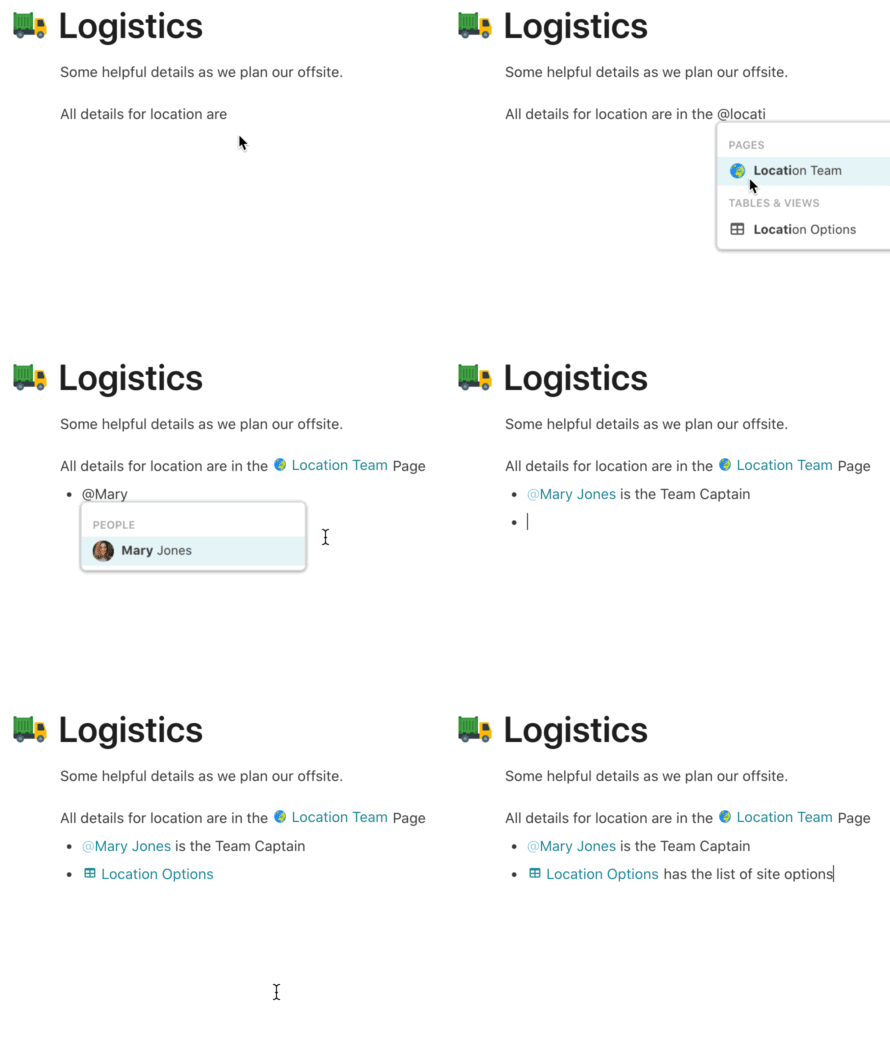
Screen Recording 2020-06-05 at 12.22 PM

When you hover over a mentioned page, you’ll also be able to see a quick view of what that page contains. Clicking on the mentioned page or its hover card will take you to that page.

Tip: Use Cover Images and Subtitles for your pages to make these cards especially powerful.

hovercard

We’ve made styling improvements to how your mentions appear, as well. Page mentions now have colored page icons and hover cards. And where mentions of people used get confused with links, we’ve added styling to make it clearer that they’re being mentioned.

Finally, it’s also easier to mention a page using drag-and-drop. Now, you can drag a page from the left hand page list into your active page’s typing surface to mention it.

We’re continuing to invest in making your docs faster overall, and we hope these improvements add a bit more speed and flexibility to your day and to your docs!
31 Likes

Ah-mazing! Thank you so much. Also nice new profile pic, Evan!

2 Likes

This is great. I’ve been using the /link —> insert page function to mention pages. It’s worked perfectly fine, but this just makes things one less step

3 Likes

Really loving this.

I might be missing something obvious - but is there a way of using this in buttons? Ie, buttons that are used to go to another part of the document? At the moment we are using URL’s. I’m hoping this might have opened up a much easier way to design navigation, although at first glance I’m not sure it has (it would possibly need buttons to have a new action added??? Unless I’m missing something obvious which often happens!)

1 Like

Hey @Brendan_Woithe we are not planning on bringing this to buttons at the moment. However, now that you can just @mention pages, you might not need the button at all right?

1 Like

Ah - we use button based tabs to navigate fairly robust sets of views…

Space / layout is important, and this is what I’ve worked out to give a compact but easy to use nav bar :slight_smile:

I realise this is an edge case - but I imagine there’s quite a few folk that have built similar nav tables for their UX

(This is taking nothing away from this feature, which has many potential interesting uses in its own right!)

11 Likes

Whoa I’ve never seen something like that. Are you using a formula to make those images show up?

1 Like

Yeah - turns out its pretty simple - once I figured a few things out. There’s a bunch of users who have posted various little hints / helps / ideas which all came together to make this.

There’s even an easter egg in it for the eagle eyed : the calendar icon changes the date along with the day of the month.

So the formula for the button label is

Concatenate(" ",
image(Concatenate("https://cdn.coda.io/icons/svg/color/calendar-",today().split("/").Nth(2),".svg")),
char(10),
"Bookings")`

And the button action is

OpenWindow(“dpnJ-AdvWke/Projects-Bookings_sujDs#Projects-Bookings-Tab_tuDZO”)

This is the “hard coded” version. At one stage I had all the url’s in another table, but since the doc structure is fairly stable, it works ok.

The table then has a view for each of the sections.

The selection on the right is per-user (it needs to be else everything breaks when there’s more than one person using the doc at the same time)
So the table has as many rows as users, and there’s just a bunch of filters so the current user see’s their row :slight_smile:

I did have a working version where the colour of the button changed so you could see the currently selected page (meaning we didn’t need the page name at the top of the page… saving much needed screen space! However, it only worked if the user ONLY navigated using the tabs. As soon as they used the menu on the left (or in the published doc, the dropdown menu’s at the top of the page) then it wouldn’t be able to tell which page was selected. No amount of trickery with url’s was able to solve this. So, we had to sacrifice space.

Here’s an early version showing the colour but without the icons.

Essentially its all towards getting the doc to act a little more like an app - to make it as easy as possible for our users. Our project management is fairly complicated - the aim is to present things as simply as possible, and to guide the user through the process rather than have them overwhelmed.

And apologies - didn’t mean to derail this thread.

18 Likes

That’s really mindblowing and you should definitely share that on the Tips and Hacks topic.
https://community.coda.io/c/how-to-doc-show-and-tell-and-formulas/tipsandhacks/12

Unfortunately we don’t have any immediate features planned that would improve this workflow. However, there are at least a couple of features coming a little bit later on that will take this kind of thing further :slight_smile:

2 Likes

This is amazing! I was just looking for this feature last weekend!

2 Likes

Good update (the duplicate page naming; I dislike the @ mention update).

And apologies for adding a bit of bitter taste to it but I have the feeling that Coda are focused on creating a blog builder, while most of us are interested in capabilities to build platforms and apps.

I’m not sure where “most of us” comes from, but people who are looking at tools like Coda, need great wiki and note taking capabilities foremost in my opinion.

Coda core features are documents and they need to master it first.

1 Like

Hi Virgil,

Coda is indeed an alternative to GSuite which already has a wiki and note-taking capabilities and tasks.

My observations are from following the community, the questions, the shared docs and also the requests I get for helping to build docs. Of course, it is just personal observation and might be wrong.

Those who joined Coda when it was Beta know that the goal was “Doc as powerful as an app”.

1 Like

No need to split hairs, but as a long time Coda user – well before it came out of Beta – I really welcome these updates to the “Doc” side (see what I did there, young Skywalker?). Coda does have a bit of a split personality: on one hand, it is part of the “no-code app” movement, and on the other hand it is part of the “Doc 2.0” movement. I came to Coda from Airtable for both reasons!

@Brendan_Woithe I love your nav buttons! Reminds me of Hypercard – Coda’s own Lucy?

@EvanBrooks @Angad - The @page functionality is awesome and tempts me to move a lot of my note-taking related work to Coda, but first it raises some questions for me:

  1. First, an old discussion around scheme – the question of whether to build one large “super doc” or many connected smaller docs. Is there a way to estimate when a doc contains so many pages that it impairs functionality? I know when we ask the same question around tables, the answer is “roughly 10,000 rows but it depends on your use of formulae.” What is the practical page limit for a doc? Is that device dependent?
  2. Second, I know that we can hyperlink to specific blocks of text on specific pages across docs. Do you ever foresee a day when we could use the “@” page mention across docs? It blows my mind to think about the list of results that it would generate, but…
  3. Finally, how much of a stretch would it be to show backlinks on an “@page”? Just as pages can currently show a list of subpages, it would be useful for a page to provide a list of other pages that link to it. #zettelkasten

Thanks for the constant flow of improvements. Love Coda!

JB

4 Likes

Hi @Stefan_Stoyanov,
I have come round to the @ mentions made in the update. Yes, it effected a bunch of views / things in our documents, but it also made it much clearer what is going on in some areas.
And there’s ways around it if your view relies on particular formatting that are incredibly simple… either using .totext() or using select lists with formulas rather than a straight lookup column. Indeed, this is a slight pain when the doc is already in use, but use of a few temporary columns and buttons in the table makes fairly short work of it.

What this update does do is make things much clearer for those who might not be as used to coding as some of the more experienced builders around here. I’m definitely one of the less experienced, and have made plenty of errors when building out our docs. This one little update would have really helped me early on as I grappled with the way that filters worked, or what it means to lookup a row vs a column of a row etc etc. Anything to identify WHAT it is you are actually looking at helps when its very easy to accidentally get the correct result, but using a slightly incorrect method, which can really complicate things later on.

1 Like

A busy day and that’s why I am brief - I like the idea of visual indicators (colours help as well). I just wouldn’t like always to be clear that some information comes from another source. Especially for viewers only.

Like I shared with a Codan, this feature is very helpful for doc builders and them only. For users it just wastes estate, provokes questions and some (like Coda hackers) dig too deep into the data which I would prefer to avoid for most of my doc users.

My suggestion was that all these helpful indications are hidden for all users who are not doc builders. Also, the symbol @ I usually use to refer to someone. When referring to a connections I would go with different symbol.

4 Likes

I get where you are coming from, and I think your suggestions are great!

1 Like

Hi @Brendan_Woithe
is it possible to change the icon size?

Thx
Tomas

I haven’t tried it, but the image() formula has options to allow you to size things as you like
Take a look at the help file for more info about how to do it!

Thanks
image properties are not working on that.