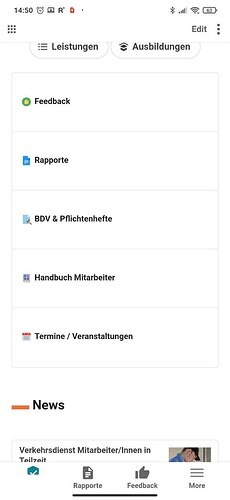
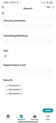
Hello Coda Community,
I think there is a lot of potential in using Coda for Mobile Apps and I think this has not yet been discovered enough. If I am wrong, please correct me.
I want to share here how I use Coda to create ‘mobile first’ apps and please share with me your thoughts and ideas about the topic.
Why use Coda for Mobile Apps? It’s just so easy to build mobile apps with complicated backend-log in Coda! It’s way faster to create mobile apps in Coda than in Glide. I stopped using Glide, because Coda is more fun and faster.
Also It’s great because all your processes are accessible by desktop also. So it integrates so well in your company processes. That’s also a thing that is better than for example in Glide.
A downside is not perfect custom design in Coda of course.
Important: Pages really need to be designed mobile first. With favorites it’s great to make a menu just for mobile.
→ This means we need Mobile First Design. In my pictures you can see some ideas so far.
I try to keep it really clean - just like in any other app.
My primary case is companies that need apps for either their employees to work on their phone or/and the customers for companies. (these can even be b2b customers of the company I develop for). I think many companies cannot access their processes with their phone. This can be a huge market.
Here are just two simple examples:
-
Security Company:
A security company that is used by their employees to fill out reports when they are done on a place. There are two different views of the apps. Employees have tabs and customers have tabs. Customers can see which places have been checked already. -
Workout App for Gym trainers:
A Gym trainer can make training plans for their customers. People add in their trainings over time and see how they progress.
The trainer can see their progress on web app and can make complex visualizations and reports.
Problems I’m running into:
I mean there could be many things optimized, but overall It’s really great for mobile apps.
One main problem: the dropdown is really bad and overall input-fields are not good.
And this is really crucial. Good input fields are a must for mobile apps.
This could be fixed I think quite easily.
Also, I’m aware that the mobile version is not perfect yet and that we can critique many things. But we can already build really good stuff with it, so lets focus on that!
One last thing: What is also really crucial is to not use it with the Coda app but to open the link in the mobile browser and creating a direct App Icon for every App I want to use. This way I can open quicker the right Doc and many different docs/apps. (Or even multiply Icons for one doc)
Let me know what you think of all of this 


 what are you missing in terms of “open approach”? this is especially interesting to me.