Launched: A refreshed Coda experience

Hi Coda community! We’re excited to share that we’ve given Coda a refresh to make it cleaner, clearer, and easier to navigate — without compromising its power. These changes are now live on all Coda docs!

This refresh should reduce friction for new users, while offering experienced makers like you a cleaner, more purposeful workspace.

Here’s an overview of what’s changing:

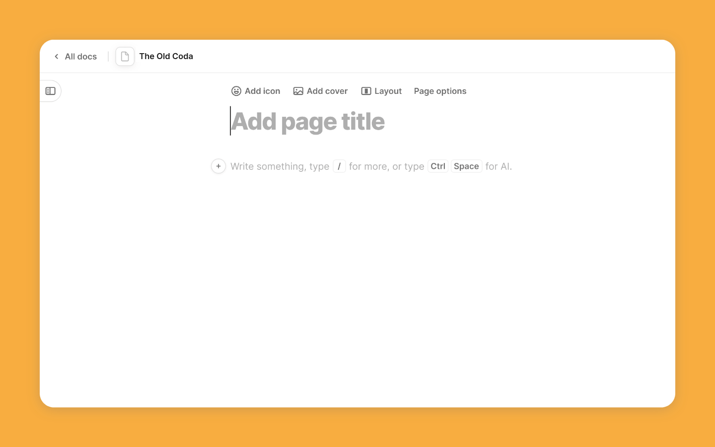
A cleaner starting point

We’ve removed visual and structural noise from the canvas by consolidating and simplifying menus and options. Now, anyone can dive into creating without distraction.

BeforeAfterEmail@2x

Advanced features, right where they belong

Power users still have everything they need, but advanced tools are better organized now. They’re available when you need them, but they’re out of the way for collaborators who don’t, keeping the workspace approachable.

  • Single entry point for advanced doc settings
  • New entry point for publishing and embedding

OptionsEmail@2x

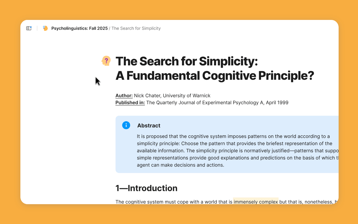
Navigation, built for flow

Navigation is now faster, more fluid, and more intuitive. Whether you’re jumping between pages or browsing workspace home, it’s easier to stay oriented and keep up momentum.

  • Redesigned page list
  • Breadcrumbs
  • Improved notifications experience
  • Improvements to in-doc search
  • Refreshed workspace home

MenuEmail@2x

Read the full breakdown of what’s changing in this Help Center article.

And this is just the beginning. We’re laying the foundation for bigger changes ahead, from new ways to build and collaborate to working seamlessly alongside AI. Coda is evolving, and we’re glad you’re on this journey with us.

As always, thank you for being part of the Coda community. We’d love to hear what you think!

29 Likes

@Harshita_Yerramreddy1 , congratulations on this important update. I just had a quick view on the updates, and I noticed there are many more than you mentioned, which is great. Looking forward to see what is coming next, and I hope it will come soon because Coda is all about collaboration and seriously working alongside AI. I love to see that coming into play yesterday ;-).

9 Likes

Well done on all these improvements! I certainly am encouraged by the direction.

Supper happy with the smaller typeface, navigation bar and…

:clap:

Eager on whats coming next

6 Likes

:clap:t2: :clap:t2: :clap:t2:

well done @Harshita_Yerramreddy1 , @Shelley_Garg1 and Codans/Grammarlians!

:partying_face: :clinking_glasses: :woman_dancing:t2: :man_dancing:t2:

really great job with this one!!!
no complaints apart from that Duration icon (which has now been changed :face_savoring_food: )

cheers!
Mel

8 Likes

Great updates! Thank you.

Please focus on a better iPad experience and more importantly the row layout canvas options. They are so limiting and the typography is terrible.

4 Likes

Hello!

Previously, I could quickly switch between any documents ( shortcuts ), but now I am unable to do so.

How can I do this without leaving the document? Where are my shortcuts?

I can add to shortcuts, but I can’t switch between them?

Thank you!

2 Likes

Well done @Harshita_Yerramreddy1 on delivering an overall cleaner experience! Our docs look a lot less intimidating to our regular users (90% of our users) and the search bar is no longer painfully prominent.

I find that things make more sense now even if it may on occasion take a couple more clicks. Settings are found where you’d expect them to be if you are new to Coda. Anything that helps wider adoption is a win in my book.

As a power user, it was a bit jarring to fight the muscle memory at first, but I’m pleased to report it only took a couple of days to fully adapt to the new UI and realize that all the features are still very much there.

7 Likes

I praise the improved notifications, particularly the failed automation notifications. They now say which automation failed, which has made it MUCH easier to find which one failed. This was particularly important to me, because sometimes a pack “refresh” fails (Google Calendar, for example) – and these generate automation failure notifications even though they’re not automations that a doc maker made. In the previous notification center they were impossible to find! Now with the new update, it tells me which one failed and my frustration is gone.

Thank you!

8 Likes

Few days into this new UI and… I am a bit disappointed that the table controls got no upgrade (e.g. try to hide the table header row - 5 clicks in 3 menus; why are Table title and Style not in Table display)

:waving_hand:t2: @Stefan_Stoyanov

do you mean this?

on the left of table its the 3 dots (vertical) to access table title and title style

hope this helps!

Cheers!
Mel

2 Likes

Header row / column headers

1 Like

for this, a quicker way i do it is to hover over the bottom line of column header and then drag up or down.

column header height.mp4 video-to-gif output image

3 Likes

Certainly! Hiding it, though, requires 5 clicks on 3 menus. Coda need a much better UX and UI, that’s been obvious for quite a few years and hopefully they will take that into consideration going forward.

1 Like

I have been using Coda for ages and did not know this trick! Thank you for sharing!

2 Likes

While much of this update looks great, I’m curious why the quick “copy link” :link: button that used to be to the right of each doc’s header was removed? I used this feature nearly every day, and while I can obviously still get the link of a page via the sidebar, it just feels like an unnecessary complication to what was previously a very useful feature.

3 Likes

Yep, hiding the copy link is quite a silly choice since it wouldn’t be cluttering the canvas. With so many things being moved with this new UI refresh! I recommend you write to the support teamalso to voice your distaste.

1 Like

Hey, Calla!

Great callout, thanks! You’re not the first to share this feedback with our team, so we’re actively looking into it. We’ll share updates as we can. In the meantime, don’t hesitate to share further feedback on any of the other changes.

4 Likes

Yes, I also really liked that “copy link” button next to the page headers. Copying the page link out of the browser bar usually includes on-page anchors that I don’t want to include when sharing URLs, so that “copy link” button was a great way to easily avoid those.

2 Likes

On whole love the new UI. A question/feedback/request:

When opening pages from different docs via the ‘Recents’ dropdown, can they open in the same tab? I frequently jump between my ‘playground’ and work docs and don’t need them in different tabs as default - if I do, I’ll use a wheel-click on the link instead. Perhaps an ‘Open different docs in separate tabs’ switch in user settings?

Many thanks.

2 Likes

@Harshita_Yerramreddy1

On table UI, if you are considering an upgrade, I would put the grouping and sorting directly into the table top menu (where options sits) and make it accessible to all users individually, like the filters

2 Likes