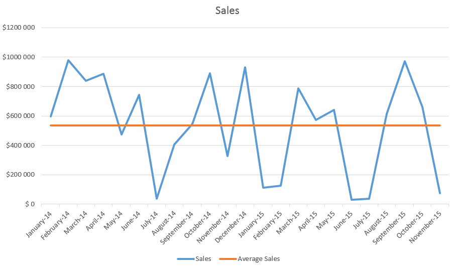
Add an “average line” to a chart/graph? Much like the second image below.
This isn’t a Coda deal breaker but would be a nice feature that (in my mind) wouldn’t take much work on the backend to add. Great feature for team production analysis over time etc.
You could do something like this to achieve the same effect…
@Nick_Milner My graph is generated based on a “Count” of rows per “Date”
In my data table, each row is an attendance record linked to people in my database and the date. How would I apply your “average” logic to my data table? Do I need a new table that takes the attendance table and summarizes the attendance amounts into per-date records? Then apply your method?

 That is exactly what I need! Thank you for helping me on that.
The last step would be to have slopes averages on a per-month basis or any variable controlled via columns, much like your “average” column.
=Attendance_All.filter(Month(Date)=Month(thisRow.Date)).Count()
Works correctly, returning the correct # of rows for the month. When I add:
=Round(Attendance_All.filter(Month(Date)=Month(thisRow.Date)).Count().Average())
It becomes invalid. Any guesses?
Are you getting an error message?
For May 2019, I’m getting “156” when it should be “29” as we have only had 1 date this month where attendance was recorded and it was at 29. Been trying some other methods and haven’t been successful yet. Will update when I find what works.
UPDATE: @Nick_Milner forgot the obvious. My data in this table extends back to last year…Just needed to add “Year” to my filter and now it works:
=Round(Attendance_All.filter(Month(Date)=Month(thisRow.Date) && Year(Date)=Year(thisRow.Date)).Count().Average())
1 Like