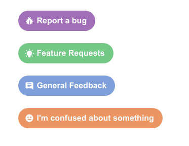
Launched: Redesigned and more customizable buttons

Add a row to a table. Open a hyperlink. Send a Slack. Copy a doc.

These are all things you can do with buttons in Coda. But as more makers publish their work with Coda and introduce their teams to systems of work in their Coda docs, we’ve also learned that we could help buttons seem more like, well, buttons!

Following some user feedback and design updates, I’m please to share a few tweaks we’ve made to buttons that give you more control over how they look, and help your collaborators more readily understand that they can click and take action in your docs!

A new, buttoned-up shape

We’ve rounded the edges to help buttons look more beautiful. The shape is common in buttons around the web so it should hopefully make them more inviting for others to click on.

Heads-up: The new shape makes the buttons a touch wider, so you may want to resize button columns if you see your button text wrapping to another line.

Way more icon options

Until today, you had a fixed set of 20 icons to style your buttons. And while we love the ‘cup of coffee’ icon here at Coda, we recognize our maker community has wanted additional customization options. Now, when adding buttons you can search the full library of icons that are available for pages to best reflect your style and purpose.

Three different sizes

Since launching new options for text sizes earlier this year, we’ve seen docs take advantage of both standard and large text sizes. However, when changing the size of your text, you might’ve noticed that your buttons stayed the same size.

Now, when adding buttons to a page, you can choose whether they are sized Small, Medium, or Large. The existing buttons in your doc are considered small, so you can go now make them larger using this setting. (This option is available for buttons that live on a page, not for button columns in a table.)

Whether you’re trying to help your buttons match the overall style of your doc, or trying to increase interactions in your doc, we hope you enjoy experimenting with some of these new options. (Tip: In a hallowed marketing A/B test case-study, a “Big Orange Button” on a landing page lifted conversions by ~32% ー you can try adding one to your doc to see what happens!)

You can customize your button size and icons in the same button configuration menu where you’ve always chosen button colors and set-up their actions. Learn more about setting-up buttons in this FAQ.

We hope this helps your docs feel even more like your own!

42 Likes

Great changes! I just noticed my button was rounded here and came here hoping it was an update!

8 Likes

Thanks! This is a great step toward a better UI for our Docs/Apps :grin:

7 Likes

:tada: !!!

This is amazing :partying_face: :tada: !!!

Thank you so so so much :grin: :tada: !!!

5 Likes

Yeaaahh! I don’t even need to read the full post to be happy everytime I see a new “Launched” title. :rofl:

7 Likes

Okay — any way to un-make that?
We’ve relied on buttons quite a bit, e.g. for programmable checkboxes like these:
image

Now they take more space. And while I get that flat is sexy, the slightly protruded ones looked more like clickable affordances (these look more like labels)

3 Likes

The button sizes and icons are so helpful!! :confetti_ball: :fireworks:

1 Like

Hey Paul, completely understand that the new design won’t be ideal for some scenarios like the one you shared or where space is limited. However, it was a tradeoff where we felt that the new button features outweighed the support for some of these special scenarios. Hopefully, we can implement other features to support what you are trying to do in a native way so always appreciate the feedback…

5 Likes

Not that I don’t like some updates. I do like all update, BUT guys - rounded ONLY? Seriously?

1 Like

Space is always limited, Angad!

And Coda starts to look more and more like for kids than for some business. Hire a new UI designer. Honestly, this is my opinion on the current design.

1 Like

I loved the full icon library, but I do think that it could be less rounded or optional. Like @Paul_Danyliuk said, in tables it can become confusing, since Look Up items have those rounded borders and somebody coming from Notion (which has a big user base) can confuse with labels too. For me, the best scenario would be the page buttons rounded and the table buttons in the middle of squared and rounded.

1 Like

Oh that’s very nice! Love this update!

this is nice!
embedding images =Image() inside buttons would be amazing…

1 Like

Sorry @Angad but I don’t see how keeping buttons shape and shadow as is would stand in the way of new features such as icons and text sizes.

Btw the former you could sorta do with emoji or images in button label, and the latter you could do with this trick.

This also broke many tailor-fitted docs where we now have to go over all of them and resize button columns.

All in all, I’d love some choice. Akin to serif vs sans-serif font in the page settings I want a choice of flat&round vs squared&elevated. My complaint is more with how unexpectedly this was rolled out.

7 Likes

I’m noticing that on the new buttons the new glyphs are sized quite small (at least on my HiDPI laptop). I replaced the glyph on a couple buttons in a table, and the glyphs are between 50-66% of the size of the previous glyph from the original set. Is this a DPI issue?

I also preferred the former design. If you give some choice towards sizing and colors, why not give the same choice towards rounds?

1 Like

Another vote against the change to rounded buttons. Icons and sizes: yay! Rounded not as an option? Nay.

We use buttons in tables quite a bit and there it’s much better with the more rectangle shaped buttons.

vs

You know what would be super-useful? If we could have document level css overrides. :slight_smile:

4 Likes

I think the new rounded buttons look great!

1 Like

Yay for more icons! :partying_face:

Dear @EvanBrooks and @Angad,

Maybe not top priority, at least for me, but I feel the need to share!

Below is a screenshot form some buttons, where the audience has the option to give feedback.

To give buttons a more professional and consistent look, it would be great to have an option to make the related buttons in a consistent way ( by scaling the text size and overall average button size) to a balanced way for all options.

image

5 Likes