It can be hard to make your docs look and feel like apps. For me, the key is in the modal layout - how a row looks when the user pops it open.
I think good row layouts help as much with the workflow and success of a tool as they do with general visual improvements. A good layout guides the user through the tool and streamlines their work.
In this video, I use my Team FAQ doc to show how to build clean layouts across 3 phases:
![]() Phase 1: general layout building
Phase 1: general layout building
![]() Phase 2: workflows layouts
Phase 2: workflows layouts
![]() Phase 3: people layouts
Phase 3: people layouts
Along the way I cover
- the layout <> table view relationship (which can trip up new users)
- lines and headers to segment the layout
- buttons to open different layouts
On this first point - the relationship between layouts and table views - I want to spend a bit more time. The trick is to understand that the two are separate. AND EVERY LAYOUT NEEDS A VIEW!!
MOST IMPORTANT: when you create a new row layout, you need to assign it to a table view in order for users to see it
By ‘view’ I mean a table or a connected copy of that table.
By ‘layout’ I mean the style and structure of the columns as they appear when the user expands a row.
Each table view has a connected layout, and you can choose which layout to expose when the user opens the row modal:

Different views can share the same layout or they can have their own. This becomes important when you want to show different information to different people or for different workflows.
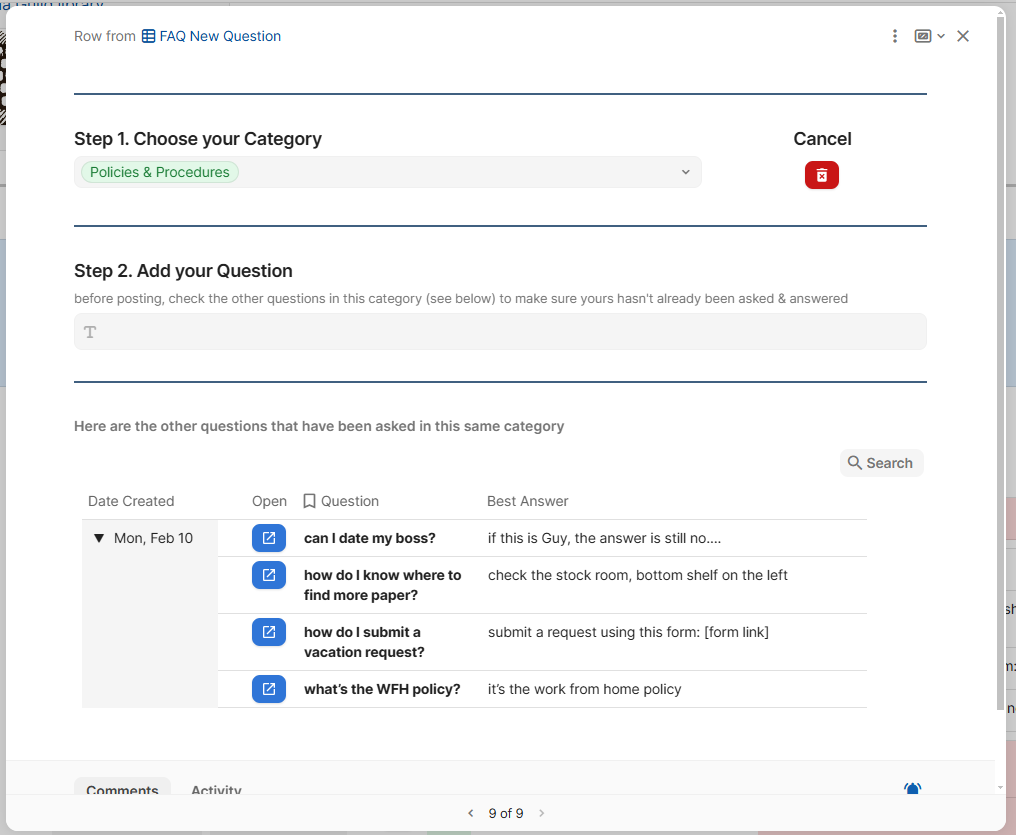
For example, when someone is adding a new question to my FAQ, I want them to select a category and write their question. When another user comes to view that question and any answers, I want to lock down the category, question, and answers so they can’t be changed. I do this through different layouts.
Layout 1: adding a new question
Layout 2: viewing questions & answers

Check out the video to see all the tips on layouts.
This FAQ template is available on the shelves of the Coda Guild Library