What I have chosen to do, is make a special page that is more mobile friendly, so I only view most relevant data when using a mobile phone. That way, I have a special page when using computer, and one for mobile use.
I have created a system for myself where I organize my schoolday as a teacher.
On the computer I use calendar view, where I can see the whole week at a glance. This page is called my week.
This doesn’t work well on a mobile phone with a small screen. So I created another page called my day. This is a table view, and it all comes together less cluttered.
This little Doc is slowly growing to be quite the useful app, where I basically organize most things about my teaching job. This is still a work in progress, and I continue to improve as i learn more and more how to use Coda.
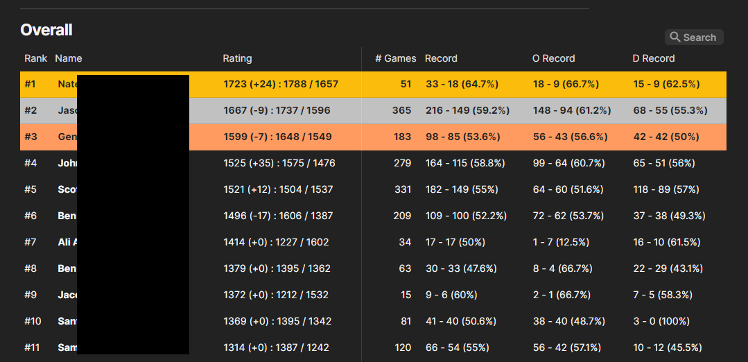
Seems like the mobile rendering of tables obeys two rules:
It renders the table like this when a Display Column is visible in this view, otherwise it renders it as a horizontally scrollable table.
When it renders it like this, it tries to include the data from all columns that are visible in this view. Maybe it stops at some point (like, the first 10 columns or so) but I don’t remember really.
I refer to the OPs screenshot as “Coda’s crappy mobile view” and I work very hard to never see it on my devices. I make sure to have the display column hidden to avoid this view.