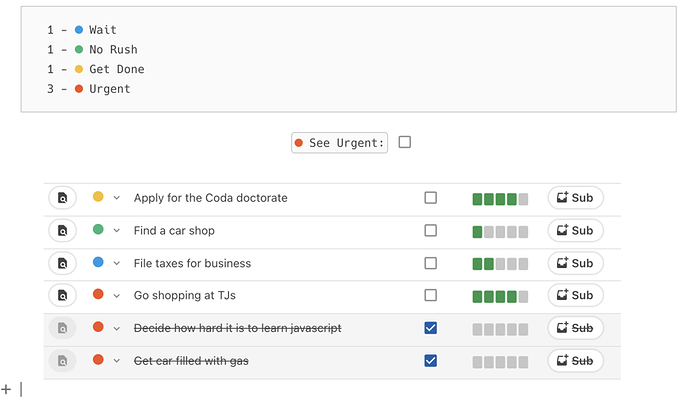
Once in a while, I am sitting in front of my Coda interface and I am getting furious - furious about the fact that the Coda team apparently does not give a damn about their interface, about the design requirements some users have, about the fact that it would be nice to have something good to nice to look at when using their SW but it is not there.
I have been “developing” recently quite a bit on Coda - a content management approach for Social Media Campaigns, a small CRM solution and some project and task management DBs. I like it, the formulas provide great flexibility, the system (so far) runs smooth and stable … BUT, it is simply ugly to look at. It is almost impossible to generate a nice view of the system.
We want to use Coda together with our customers, run project reviews through it, present the campaign process, etc. For that we need not only a nice interface, but our logo on the screen, our fonts, our colours.
But not only for our customers, also internally it would be awesome to have something nice to look at - but it does not, it looks like an IT developer screen. Menus, colours, logos, fonts, pictures, icons, … I know it is not that difficult to upload this stuff, it is actually pretty easy to makle that work … if you want!
I just have the feeling they do not care!
Am I the only one?
Am I the only one for whom it is important?
Am I the only one who thinks that a nice interface drives emotions, and emotions drives business?
Am I the only one who is working with their customers on Coda (and I showed it to some and they do not like it)?
Am I the only one who is deeply frustrated about this?
I have spent quite some time on this solution - and it is great, if it were not so ugly it would be even better. We will take some decision which solution pathway to go pretty soon … and I know our staff will not like this and we will not frustrate out staff …
Any improvement to come?


 .
.