After we launched our massive improvements to cards last month, we heard there were still a few tweaks we could make that would help you have an even better experience with cards in Coda. I’m excited to share some of the additional improvements we’ve made in the last few weeks based on your feedback, which just might help you say “Goodbye Trello, hello Coda!”
Customize your cards even more
We’ve seen a lot of great patterns that make use of cover images on cards, but we heard that the formatting and cropping options felt a bit limited, especially when you want images to be front and center. We’ve added a new “Large” layout option to accommodate portrait-shaped images, which you can pair with the “Fit” or “Crop” size options to provide the best display of your images.
Like we did with ‘+ New Row’ for tables a few weeks ago, we’ve made the ‘+ New Card’ button optional in your card views. Just toggle the “Show Add Card Button” option on your Card Display settings to make any changes or simply right click on the button to hide it. This should be especially helpful for sets of cards grouped along the leftーnow you don’t have to let the ‘+ New Card’ button take up horizontal space as you scroll!
Manage your groups more easily
One of our long-hidden features is now a lot easier to find and use. With our latest update, you can adjust common settings for your groups by simply selecting the 3-dot menu from group on tables or cards.
These options include:
Pin Empty groups: Sometimes you need to keep groups showing even when they’re empty. Now you can more clearly adjust this setting from group options, as well as directly from the kebab menu.
Sort Groups: Sort your groups in ascending/descending order or go back to a custom sort.
Manage Groups: If you’re not in love with dragging entire groups across your doc canvas or want to pin specific hidden groups, you can use the ‘Manage Groups’ option to reorder your groups by dragging and dropping them directly within the ‘Group options’ menu
Thank you for catching that! We’ve updated our post for the intended phrase.
While we encourage makers to use the tools that work best for them, as a member of Coda’s marketing team I get excited about the opportunity to help more makers consolidate into one surface so I provided that last sentence with a typo before my morning coffee. Totally my mistake!
The pin empty columns is an old wish and I’m very happy that you added it! Just in time for my brainstorm with students! Perfect! Keep perfecting cards, to be the best in this field
Quick adding cards, fast editing, I’m still preferring Trello for quickness, but don’t worry, you’re getting there!
@tomavatars that feature has been there the whole time so the fact that you weren’t able to find it earlier despite wanting it is good validation for this change!
Hi @Morgan, thanks for the feedback, this is an issue we are aware of and is on our list. It applies to grouped lookup columns or people columns. If you’re using a lookup column, you can try using Lookup order and rearranging the looked-up table. Otherwise, unfortunately your best bet for now is to try switching to a select list. Thanks for flagging!
@Angad wooot?? The pin empty columns? I mean, I knew how to pin empty columns, but you had to go back to take view, then open groups menu and pin all the tabs , isn’t it? Or is the pin empty columns menu existed also?
@EvanBrooks - any possibility of being able to set a fixed height for card “lanes” so that they can scroll independantly from the page. We have some lanes that are very long and it makes the view hard to use.
Here is an example of how I would personally like it to work, I hacked it in using Chrome developer tools for demonstration.
@EvanBrooks Edit : This started working again. I don’t know how long it is going to last. TL;DR Concatenate(Button(), Button()…) doesn’t work anymore in cards view, is there a better way? or possible enhancement for cards view to actually support multiple controls in a row?
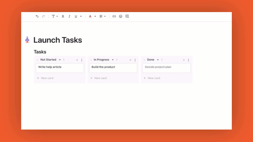
Immediately after the release of first batch of cards improvements, I redesigned my tasks dashboard like this
Notice the disabled row (it used to be active until this second batch of cards update) at the bottom of the card . That bottom row contains a Concatenate() of several Button()s. This setup made it possible to have several buttons in a row. This new kanban style redesign was really cool and working very well until the second batch of cards update.
Now after the second batch of cards update, the buttons row is disabled in cards view. It still works in table view. The default card view allows only one button per row, but as you can see, if I stack these 5 buttons, one per row, in a card, it would be a terrible waste of space (and of course ugly). I know that I am using unspeakable Button() here, but is there a better way to have more than one button in a row?
The same concept is applicable to any controls. For example, it is a waste of space to put just one checkbox in row. So if there is a way to combine controls into one row (a button and checkbox, several buttons, a check box and a scale) that would make cards really compact.
Allow to group both on top and on right (swimlanes)
Allow for more programmatic control over groups. E.g., I want to make a board where each user would see their set of lists, empty or not. If I use a filter for that, then empty lists will be gone. And if I pin empty groups, all will be pinned for all people (you cannot pin different columns for different people). So neither would work. I want to control the list of groups and the dataset for the cards view independently.
I want more control over sorting. I want to be able to sort groups not by alphabetic order, but by arbitrary value (speaking of groups on lookup columns, for example). When display column value changes, I want those groups to stay in the same order as pinned.
@Angad you recently mentioned if there are ideas/use cases for additional dimensions with grouping, “swim lanes” is a very common one high on our wishlist.


 !
!


