Launched: Cards 2.0 - More features, cleaner design & easier interactions

Kanban boards and cards are great ways to visualize, manage and organize tasks, workflows, goals, inventories, and more. Although Coda has offered Card views for your data for a while now, we’ve heard loud and clear that you’d like us to invest more in this feature.

Today, I’m excited to share a massive upgrade in design and functionality for your cards.

Here’s a summary of what’s new:

A New, Cleaner Layout

We’ve made changes to the design for your cards to allow more cards to show (especially when ungrouped or grouped along the left), and more intuitive scrolling through cards without the halting “scroll within each group” experience. We’ve also made it clearer and easier to add a new card via the “+ New card” option within each group; click it to open a modal to input the data for your new card.

Upgraded Interactivity: Buttons, Checkboxes, Controls & People Avatars

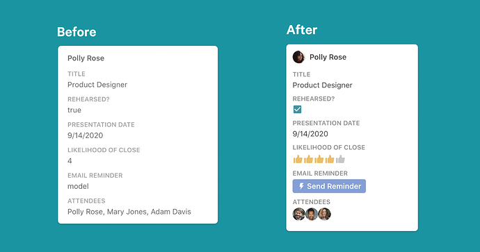
Buttons, Checkboxes, and Controls (sliders, scales, etc.) are now visible and functional on your cards! Previously, we’d show a numeric value for scales, and “model” as a placeholder for buttons. Checkboxes showed a true or false value. Now, you can click a button directly on your card to send reminders, or open the row modal for a card to update checkboxes and values for your sliders, scales, etc.

For consistency in all your table views, people columns will now show people with their avatars on their cards as well.

Updates to Conditional Formatting and Lookup Value Styling

If you used conditional formatting on card views before, you had two options: (1.) style the entire card to match your formatting by applying it to all columns, and/or (2.) “highlight” the text from an individual column based on your rules. While you still have Option 1 in this new design, in cases where you only want to format a portion of what’s on a card, the formatting is now presented in full width for improved visual impact.

If you use lookup values with formatting, the lookup values will now recognize source styling on your cards. We’ve also fixed an issue that sometimes resulted in text being clipped for lookup “chips,” and will now wrap text so you can see your entire value on the card.

Easily open, edit and manage cards

Based on user testing and your feedback, we understand that the expected behavior from other apps is that a single click opens a card for editing, and that our double click behavior was confusing for some. We’ve updated this behavior so that you can single-click on cards in Coda to open them for editing.

Additionally, unless you knew to right-click on a card, you probably didn’t know that you could expand, insert or delete cards directly from the card view. We’ve swapped out the old “expand” icon in the upper right hand corner of your cards for a kebab (3 vertical dots) menu, which gives you access to all of those functions. Now you can expand a row, insert a card, or delete a card from one, easy-to-access menu.

Customizable Content

Originally, when you converted a table to a card view, we added every column with its header to your cardーthis resulted in some pretty unwieldy cards with extraneous information! Starting today, we’ll still show every column, but we will hide the column headers by default to streamline your cards.

Something you want to change?

  • You can still use the “Card Display” menu to choose whether or not to show column titles or images, and how you’d like to format images if they’re shown
  • Open the “Columns” menu to show, hide, reorganize or adjust the settings for your columns

We hope these updates encourage you to feel like you’ve got a few new cards up your sleeve when making in Coda, and that you experiment with new ways to visualize galleries, tasks and teams!

For some ideas of how to make the most of the new Cards, check out this doc: https://coda.io/@evnbr/making-the-most-of-cards

Want to learn more about how we thought through these product updates? Join us for a “Behind the Building Block” Crowdcast on September 15th: https://www.crowdcast.io/e/5kzcn94c

53 Likes

It would be great if the group could be automatically collapsed if it is empty. This is very convenient in CRM for freelancers, where there are several statuses, but not many leads.

4 Likes

Awesome update! Well done, Codans!

One suggestion - remove the “Copy link to card” from embedded docs, as this is a bit of a security breach.

2 Likes

This is absolutely fantastic! I am so impressed and will use immediately.

2 Likes

Great job Codans :trophy:

I just watched the sample doc on a mobile device, looks nice, but for not experienced users, in the kanban layout it’s not obvious that there are more cards at the right and or left depending where you are.

In some way it needs to be shown that there are more columns on the right :arrow_right:

5 Likes

This is wonderful, thank you!

For some reason, when I group by type I get the same header showing up multiple times (Done and In Progress show up twice).

Any idea why this might be?

Edit: Worth noting that this did happen before the update, but I thought maybe the update would fix it.

2 Likes

Wow! That’s a huge update! It makes cards much more usable and “ready for prime time” with users whose expectations have been set by other more ‘card-centric products’. Well done Codans. I will definitely be making greater use of cards in future docs!

1 Like

I’m always happy to see expanded formatting options & visual improvements in Coda and am a big fan of the Card View : )

Yeees! Finally! I’ll try this as soon as I’ll get up :grinning:
Thanks codans!

Great stuff!
Any imminent plans to work on the expanded cards layouts themselves? It would be great to get some more formatting options here other than the Quick Styles and also to make the experience generally less clunky if you’re working with anything more than handful of columns.

3 Likes

I have some notes, the “new card” button MUST be on/off, because it’s 2 year that i use cards in my layout and they are added using a “form-like” table (in detailed view) with a button that create a new row, and now that button makes super confusing all of my layouts!
P.s. we have still BIG issue with 2 columns layout, see screen:


ezgif.com-video-to-gif


Now more than ever WE NEED AND DESERVE A ROADMAP!
I CANNOT HAVE BROKEN LAYOUT IN PRODUCTION DOC OVERNIGHT
I CANNOT LOST DAYS TO RE-MAKE ALL OF MY LAYOUTS WITHOUT HAVING A “HEY WE ARE CHANGING THIS AND THAT, BE READY”

I cannot have a layout that is ok today and who knows tomorrow, guys, just let us know what’s in your heads, if the doc is my product and people use it, it cant change overnight without notice, it’s bad from every point of view. Coda is not more in beta, isn’t it?

I clearly understand why you keep your future features secret, it is convenient, and i was ok with it, multiple times we have talked in this community about roadmaps availability, and while Coda was still in his juvenile form not releasing those is reasonable, but that’s not fair no more for the users of an reliable web app out of beta.
ESPECIALLY if the new idea of coda is also an App Maker, app layout and usability cannot change every week.

Please, can we have a roadmap? Or, if this classified military secrets cannot be opened like pandora box, just tell me as an app maker on coda how i should organize my layout.
We all know and use this “trick”

That is “approved by coda” as today (i mean that no one has ever said ‘don’t use this guys, it’s gonna be possibly broken in future updates’, and actually some demo doc from codans use this “hack”, so yes it’s logically supported)

So, now this work, and what if tomorrow it’s no more supported? is this “my business” to care of?
Will the answer be "Oh sorry Mario, we do not support this or that no more, you have to re-write your entire app basically :)))) "
Because that’s not cute…
Don’t take me bad, i LOVE new features and improvements in UI, and apart for some inaccuracies due to all the possible different combination that docs can offer, i really like this improvements, but if this is how things are gonna work in future, i want a “Coda App Layout Best Practices”.
A repository of the “supported way of doing things” related to app making, to respect the time i’ve put into my coda app.
And what is indicated as “supported” in that file/doc/whatever MUST be really supported in a future-proof way into coda.
If not, my app is a joke, and no one like to waste time and resources, or not?
Thanks for the update and for the patience to read all of this, but please remember that for some of us coda is a serious work tool and not a cool web app to manage light dataset…


Update: i have been too rude in this post, i’ve just finished re-imagining the ui and the layouts trying to fully use the new Cards 2.0, and i have to admit that they add a lot to coda.
Thanks to conditional formatting, layouts can have much more possibilities to be good ones, and it gives a “dashboard look” if implemented with creativity.

I apologize to codans for being heavy and not super constructive in the criticism, before i have even understood what the advantages could be.
I lost some hours on this, and yeah in future if it possible to not “break” docs during the night i would be happier…
Not only for me but also for all my doc users that are not into coda and simply find confusion in unplanned changes…

@Guilherme_Salles I’ll take your good advice and from now on I’ll stay on the marked path more often, it’s convenient for me at the end…

P.s. Some details are inaccurate, like here in top grouping:
ezgif.com-video-to-gif (2)

Where text cover the graph below

1 Like

I can’t agree more! It’s been quite stressful for me on few occasions having to stay late unexpectedly because an update has been introduced and all of a sudden we can’t do our job well.

1 Like

My suggestion: Don’t use tools the way they are not supposed to be used. Yes, people love to incentivate to create things your way, hack stuff, but in EVERY software you gonna find updates that may change your workflow and if you tried to create some complex workarounds you will be in trouble. But I do agree, It’s important to have a roadmap or week earlier message about an upcoming update.

3 Likes

But in all 3 cases, the “before” view was so much cleaner, minimal and uncluttered than in the “After” view. This is super paradoxical. The best thing of cards view was that they were just neat grey plain text and so beautifully clean! Now they have became an all cluttered and confusing pastiche of different colours, icons and images… Please at least make a settings option to revert this and have minimal cards again! Also, consider tha one of the biggest advantages of Coda over Notion, Airtable, etc is its super beautiful well crafted and minimalistic sleek design. If Coda loses this subtleness it will lose one of its core advantages over the competitors. Please don’t overlook that aspect.

Hi @yakinbozek,

With table views you can create a view that hides the columns you don’t want to show. The row popups can also have their own custom layout per view, so you can still how all the info when a row is in expanded view, but keep the cards as minimalist as you want.

These changes are largely additive to what was there or fixed what wasn’t working quite yet, like buttons being able to display.

Change your table to “Table View”, hide some columns, then go back to “Card View” and you should see only the columns that are visible.

Hi @Mario,

I’m sorry the layout trick ended up being an issue with this update. I can say that we hear you on wanting more canvas layout options and have been researching this a good bit. I don’t have any definite info to post, but I think you’ll be very happy with where Coda is going in the coming months.

3 Likes

Hi Coda team, thanks for the work on this, great improvements.

Around Updates to Conditional Formatting and Lookup Value Styling, specifically the lookup value styling – am I correct in understanding that the style is only full width per the screenshot if the text was otherwise clipped? Is there a way to format a chip to always display… well, not as a chip, without another column to convert it to text just for display purposes?

Context being, when passing docs to non-makers/editors, the chip is a visual indicator about the doc architecture that mostly adds noise for those that don’t know or care.

If you don’t push something to the limits, how you will know the limits? :wink:

1 Like

This was some of the worst parts of Coda, the Card view… and now… its great!
Thank you guys to give this a face lift. I like it! :heart:

3 Likes

For us, this update is amazing. Now non-coders appreciate the card views we use for kanban boards, sprint planning etc as well, as they are much cleaner AND prettier. Good job, and thank you!

2 Likes