What's wrong with Coda's horizontal navigation?

Do the developers have some personal vendetta against horizontal tabs?


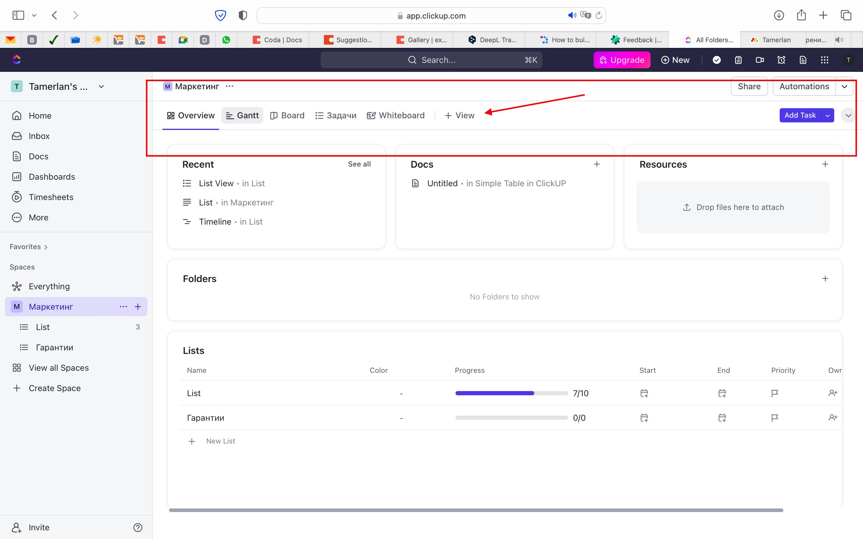
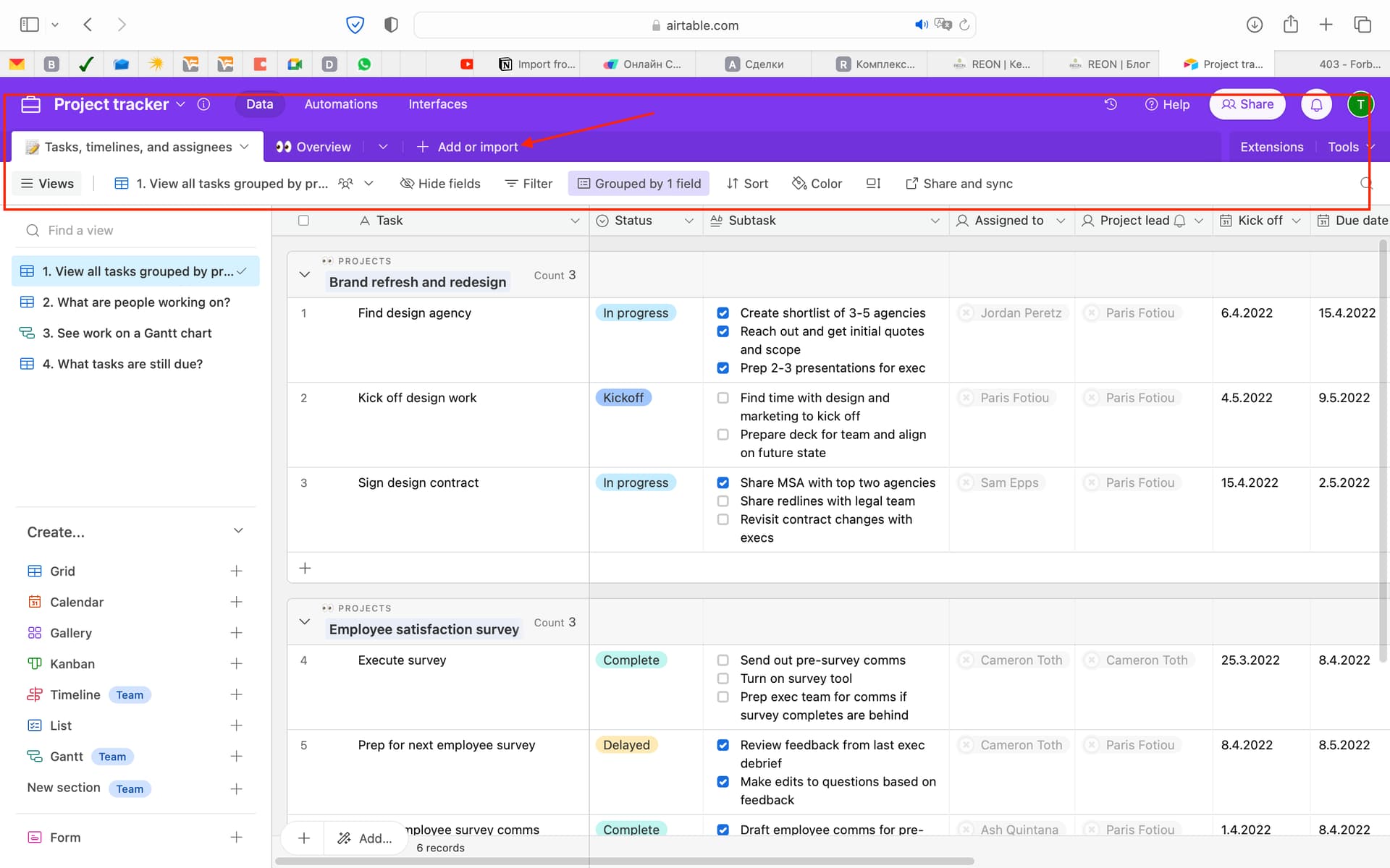
Just take a look at the screenshots of popular SaaS platforms and how they organise the navigation of sections in the workspace. Don’t you find a common pattern? It is the presence of horizontal tabs as an element of convenient navigation.
It’s really convenient. The ability to combine horizontal and vertical tabs allows you to create a convenient and compact navigation in the workspace. However, in Coda, for some reason we only have vertical tabs or vertically organised navigation elements. This also applies to the tool for grouping rows in databases.


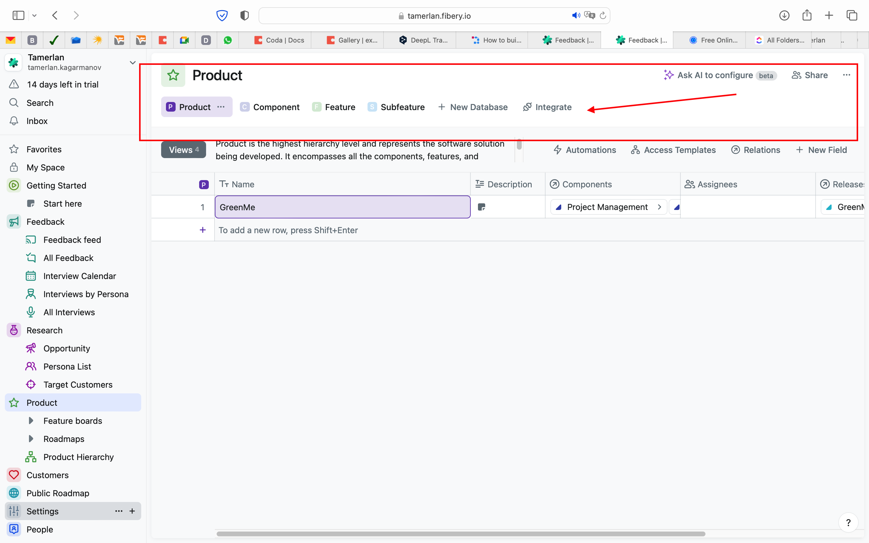
Just take a look at the screenshots from some of my workspaces in Coda. Don’t you find a little bit of a pattern? Just vertical tabs and vertical navigation elements in the interface.
The lack of tools to create horizontal navigation is very limiting in order to create a more thoughtful and compact navigation in Coda. All database views in Coda are already quite “sprawling” and heavily indented. Instead of using every square centimetre of workspace efficiently, we have to put up with a rather “bloated interface”. And this is not just my personal complaint. My clients often complain about it, comparing the compactness and convenience of the interface with ClickUp or AirTable, for example.
I know the Coda community is very loyal to the product and perhaps for many this is not an issue at all. But I think that Coda has interface problems and I would like to hope that they will be resolved in the near future.

@Tamerlan_Kagarmanov

It is possible to organise a published doc to have horizontal tabs:

It is also possible to group columns in tables horizontally:

Having said that, I would recommend that you explore using fewer pages, and make more use of canvas columns in table to organise data.

Regards
Piet

Neither meets the requirements.
Displaying pages as horizontal tabs alone is not enough. Especially this feature is only available for public docs In addition, it looks extremely cheesy. It is rather a feature that Coda has for a tick. Just look at how it is implemented in other systems.
Also very lacking is the ability to add different views of databases in the form of horizontal tabs.
As for displaying the group horizontally. In this case everything works literally. I.e. all properties are lined up in one line. And if there are many other properties in my group in the table view, I get a “long train” of properties. In 99% of cases this is impossible to use. Why in the case of horizontal grouping can’t groups be grouped under each other to make it look compact?


Look how simply and elegantly this is done in other systems. I know many users especially don’t like the comparison with Notion - but nevertheless take a look at the screenshot.

Well, that makes sense!

1 Like

Hi Tamerlan. These two articles discuss creating navigation buttons for your doc. Basically, create a header section where your navigation buttons will go. I use the Doc Explorer pack to get a table of all the pages created in my doc and build those buttons. You can create a dynamic tab menu for each page via filtering this table.

and

Here’s an example of my template page lay out with buttons. It’s not as pretty as Clickup or other common SaaS but I have more flexibility to create the same functionality for much less than they charge (especially per seat).

Hope this helps.

Oh so fun to see my doc being suggested. @Tamerlan_Kagarmanov if you want some help creating a “navigation” bar, let me know. I have also as someone else said used the Doc Explorer pack with my technique to make some easy to use Navigation bars. I also take it one step further and I have a table of buttons I call “tiny buttons” and they do different things. I keep the table updated, can add more “tiny buttons” in the table, then they all update on the navbar’s that I use. I don’t know that I’ve shared my “tiny buttons” trick anywhere but it works on the same principle as the nav buttons.

Thank you for the recommendation. I am well aware of all the features of Coda. Including what the buttons can do. But such solutions are “crutches” in their purest form and also require spending precious time on what will ultimately be a compromise. Take a look at the screenshots of third-party platforms again. AirTable, ClickUp, Notion, Fibery, Monday.com. All of these companies have come to the same rational decision. Why would I want to invent something with buttons when there is already an established and more convenient standard?
It would make life a lot easier if:

  1. Add the ability to create new horizontal tabs for table views.
  2. Make horizontal grouping not in a row, but by stack.
  3. Make interface elements more compact. Make the height of table rows smaller. We deal with a huge amount of data and elements that just sometimes do not fit on one screen.
4 Likes

+1 for option multiview with horizontal select/nav
Exemple :
image

4 Likes

I think it’s just a different way of viewing tables. Notion shows one table in the same space and then all the views of that table you choose from the tab and changing those tabs shows different views of the same table.

Coda, went a different direction where each view of a table is displayed on a different page.

There’s pros and cons to both. So you are comparing apples and oranges here. The tabs on Notion aren’t necessarily a “navigation bar”. It’s just choosing different views of a table. As far as a true navigation bar in Notion, I don’t think they have one either. You can reference pages via links and sort of build one. Which you can also do in Coda.

I find Coda better overall than Notion due to the automations and all the packs that exist as well as being able to layout my edit window for tables with multiple views available. Notion, still doesn’t allow me to have a layout for a table edit view other than just reordering the long list with is not acceptable for most of my clients.

I do like some of the options in Notion as to it’s look/feel of just text pages. Unless it changed Notion allows you to create columns across a page and then you can create sub columns in those columns as well. That is one thing Coda is still lacking that I’d like to have available. But given all the other Coda features Notion doesn’t have, I find Coda to be a better product.

I’m not arguing that Coda is better than Notion. It is specifically about navigation and the way data is presented… And the fact that Coda has chosen a different direction is not just a “different” way, it is in my opinion not the best way. So I disagree that I’m comparing apples and oranges. You are saying that multitabs in Notion are not necessarily a navigation tool. That sounds strange. Yes, it’s just a choice to view a different table. And it’s a convenient and instant way to switch between different table views, which is also navigation.
In addition, multi-tabs use the interface workspace more rationally and use the same amount of space when you switch between them. In the case of Coda, the new table view takes up unnecessary space on a single page. Why would I want to create an extra page to put a new view on it, or create a clutter of these views on one page to scroll down endlessly?
You’ll say well there are links or “Outlines” that allow you to jump to the desired view. It is inconvenient and many new users are confused when a screen with hundreds of rows in different tables makes a scrolling animation at the moment when it jumps you to the required view. When you could just click on a tab and you would instantly get the desired view.
I understand your love for Coda and share it. But sometimes love makes us blind. Once again I draw your attention to how the interface is implemented in other platforms and why it is done that way. And what Coda can usefully learn from it. Perhaps you just haven’t worked for a long time on the platforms I described above and we don’t fully understand each other.

2 Likes

One of the things that I repeatedly point out in response to questions like this, is to not try and replicate other tools in Coda. If you want to use Coda, learn Coda. As Picasso said, first kearn the rules of painting, then proceed to break them. Don’t learn the rules of other systems, and then try and force Coda to fit into their model.

You started out this thread complaining that there is ONLY vertical navigation in Coda. Now you complain that those horizontal navigation methods do not work the way YOU want them to work.

I believe your initial question was about “navigation bars”. A navigation bar is a menu bar that is built to take you to different parts of a web site (usually), or in this case a “doc”. What you are calling a “navigation bar” in Notion is not a navigation bar but something built into a table allowing you to see different “views” of the same data. As you say, this is common in other tools. Yes, there are many tools out there doing the same thing in the same way and you are free to choose one of those that fits your definition of “right”.

However, as I stated, Coda chose a different way to handle this and it is a powerful way to do so but in so doing, it removes the option to see different views of the same data table in the same “space” on a page. Why is this important? It allows you to filter each view differently, not just displaying different data in the same space with the same filter. It’s a completely different ideology.

Again, I have to say you are trying to compare apples and oranges. It is true there are no “tab” views of the same data. However, I can make a doc that simulates this by putting views into a canvas column and allowing you to view the same data in the same space.

Just because one tool is different and chose a different ideology for how tables should display does not mean those of us preferring Coda for the long list of things it does better than Notion makes us “blind”.

I have six children. I have 3 boys and 3 girls. Each of those children is different, behaves differently, learns differently, looks different. Although my youngest son is a carbon copy of his oldest brother, he is not his older brother and I have to remember that. They are similar, but quite different and separate individuals.

Does this make one child better or worse than another? Am I blind in loving them all? No. I appreciate their differences, I help them to see their weaknesses and hopefully improve those and I celebrate the things they do well.

Perhaps you could apply this same ideology to Coda. Coda will never be Notion. Many of us here feel Coda offers a much better product. There is one thing I think Notion does better but it isn’t their view of tables. And if Coda just did things the same way “every other tool does”, then we wouldn’t really need it would we? In fact, as you pointed out, everyone else does it that way. Maybe that’s why Coda is different or even better is because they didn’t just replicate everyone else. They created their own unique tool.

My late husband was always wanting me to be just like him. He seemed to think that in order to be compatible and get along, I needed to do everything just like him, think, just like him, act just like him, have the same strengths and weaknesses as he did. I used to tell him, if we were both just alike, then one of us is unnecessary! I don’t need another me. I need someone who possesses strength where I am weak, who can do those things I cannot.

If Coda was just a duplicate of Notion, one of them would be unnecessary.

2 Likes

Yes it is possible to accept Coda for what it is and play by Coda’s rules. But that doesn’t mean that such an approach will be productive. I realize that almost any Coda flaw can be compensated for with Coda tools. But there is always a question of balance between creativity in Coda and rationality. It is rational to leave something as a native function and not spend extra time on creating trivial things that can be in Coda by default.
As for your words:
“One of the things that I repeatedly point out in response to questions like this, is not to try and replicate other tools in Coda. If you want to use Coda, learn Coda. As Picasso said, first kearn the rules of painting, then proceed to break them. Don’t learn the rules of other systems, and then try and force Coda to fit into their model.”
:point_up_2: This unipolar stance you hold may seem arrogant. It sounds like the rest of the users are not worthy of a simpler approach in Coda.
Coda is a really good product but it is imperfect and like any other application it has its own features. One of those I consider a flaw.
You are implying that there are contradictions in my track. However, I don’t see it that way. One problem flows from the other. And I insist that:

  • Coda has virtually no horizontal navigation.
  • And those elements that could be horizontal navigation work illogically. I have attached screenshots on purpose, because I admit that as a non-native speaker of the language I can express my thoughts inaccurately. But I think anyone who wants to understand what I mean will understand.
2 Likes

My question was basically about the approach to navigation in Coda. The lack of multi tabs for individual views in tables is one of the aspects I emphasized. As well as the principles of horizontal grouping in Coda, as well as the lack of a horizontal page navigation menu. The combination of these principles is what makes the user experience in Coda difficult for me. That is, I’m talking about a systemic effect that is made up of how it’s organized in Coda, not literally every feature. Because I’m looking at it as a whole. Perhaps there is a misunderstanding in this.
“It allows you to filter each view differently, not just displaying different data in the same space with the same filter. It’s a completely different ideology.” - I don’t understand what you mean by that. In Notion as well as in other applications you can create views with different filters and different data in the same space with the same filter. It sounds like you don’t know enough about how this is actually implemented in other products.
You are focusing on Notion for nothing. I am basically talking about how it is implemented in many other products in a similar-standard way. Notion, Fibery, AirTable, ClickUP, Monday and others. I’m not saying that Coda should become Notion. Although Coda is a direct work around of Notion’s mistakes in terms of functionality. And obviously Coda was inspired by Notion at some point. What I’m saying is that it would be nice if Coda took note of useful principles that are implemented in other platforms. You call it a “different idealogy”, and I think it’s far-fetched by you personally and is in fact an underbelly. It sounds like you want to want to want to think it would be so. I apologize if those words sounded harsh.
I realize that Coda’s individuality is what made Coda what it is. But that doesn’t mean that Coda is perfect in everything.

2 Likes

@Tamerlan’s words deeply resonate with me, as they do with hundreds of users from the companies I strive to innovate for.

Coda still feels too often like a playground for devs, especially when it comes to UI and UX. The bulkiness of elements and the excessive blank space everywhere…

I enjoy the fun part of finding a cheat code (twice recognized by Adobe for finding hacks on their products). However, I hope that Coda focus more on the UX and UI soon. Hopefully, early next year after they fix the more pressing issues with bugs, access, security, etc.

For the moment, I present everything I create for businesses in Coda as “prototype”. And Coda is phenomenal for that. When the functionality is approved, when business processes seem right, we have to move to no-code app builders like AppSheet, MPA, Zoho Creator, even Bubble is providing better UX. I hate that part. Business owners hate it even more. Users are ready to hang me on the nearest tree for making them learn 2 systems in 2 years time. But users should love to use it. And the doc makers are not the users.

5 Likes

What is it that you want @Tamerlan_Kagarmanov? You asked a question and everyone who tries to offer you assistance is just told how wrong they are for not agreeing with you.

If you want assistance with something in Coda, this community is ready, willing and able to help you.

No one here has ever said Coda is the perfect tool and has no flaws.

Many of us here, myself included have decades of programming experience in the real world, with real programming languages, real databases and real coding, not just low code/no code experience. For whatever reason, we have chosen Coda as one of the tools in our toolbox and find it very useful in many cases. It is always the right choice for a person or a project? No. But it does allow us to do a lot, and building for clients much faster than traditional programming does.

Coda also allows users with 0 coding experience to do things that they wouldn’t normally be able to do.

Maybe the real bottom line here, is Coda isn’t the tool for you. That’s fine. You gave it a try. Now go find the tool that is everything you want it to be. Or maybe you can build your own perfect tool that is everything you think a tool should be.

I wish you the best of luck in whatever path you choose.

1 Like

That is it.

I’d like to close the discussion here and thank everybody for the contribution made.

Christiaan

3 Likes

First of all, I would like to draw attention to the principles of navigation in Coda, which I consider to be a problem. This appeal is primarily to the developers and to those who believe that this is a real problem and not “another ideal” or “something that only a select few can understand”.
There is some resentment in your post. You are offended for nothing, it was not intended to offend you. I was only defending my point of view. Because I think that the position “If you do not like Coda (certain things in Coda), then go to other platforms” - is not correct. By the way, you also hint about it in your last post. I am grateful for your proposed variants, but I tried to explain that this is an attempt to “treat the symptoms, not the disease” and the essence of the problem lies deeper than your tolerant attitude to the way it is organized in Coda. I like Coda, but there are certain things about it that I find problematic - that’s all. But for some reason this has agitated you, as if I have desecrated some sacred thing.
I hope I understand your point of view and I think it is pointless to continue with you on this topic. Otherwise it will turn into a dialog between a “religious zealot” and someone who is just trying to find answers. You love Coda, you think there are no problems with navigation - that’s fine. I think otherwise and will continue to work in my field.

1 Like

The discussion has unambiguously gone off the deep end with some users. It just amazes me that in literally every community there is a segment of dedicated fans who just can’t accept an alternative point of view. It’s not fashionable to criticize Coda. And if you dare to do so, it’s presented to you in a way that you’re the one who doesn’t understand the “subtlety of art” and “higher design”. An attempt to move the discussion to the level of objective reality is for some reason perceived with hostility.

2 Likes