Tables and Views are some of Coda’s most fundamental, powerful building blocks. For quite some time, various settings and formatting options have been scattered about our UI. Today, we’ve pulled most of them together into one configuration panel.
In addition to giving these settings a more uniform home that looks and feels more like other settings menus in Coda, our user testing revealed that this has the added benefit of allowing you to make changes (like configuring conditional formatting) without a drop-down menu obscuring your view of your selections.
As you’ll notice, Tables now only show Filter, Sort, Columns and Options . To adjust any other settings or formats, you must click ‘Options.’ As shown in the GIF above, Conditional Formatting is accessed via the ‘Options’ entry-point.
In addition to aggregating options in the right-side panel, we’ve also decoupled ‘Sort’ and ‘Group’ so that they can be more easily managed as separate table settings. You can access ‘Sort’ from the Table or the Options menu; ‘Group’ is now its own option in the Options menu.
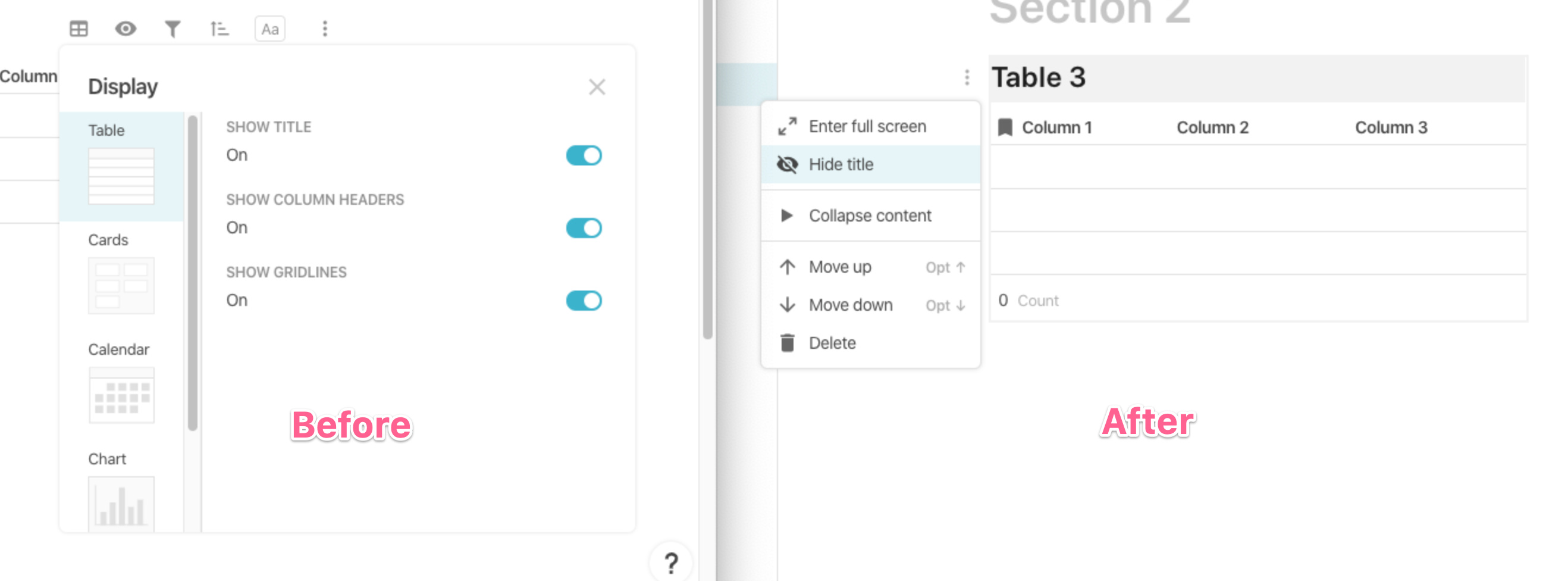
Finally, based on your feedback, we used this opportunity to move the ‘Show’ and ‘Hide’ options for a table’s title closer to the title. While toggle used to be in the ‘Display’ panel, it is now accessible via the ‘kebab’ (three vertical dots) menu right next to the table title itself. This should reduce the number of clicks it takes to hide a table’s title.
Thank you for the great feedbackーespecially from our Beta testersーand we hope this creates a cleaner, more uniform formatting experience for you and your tables!
This is very nice update which structures the work on a table. Tips are also very nice! Overall, very cool update!
There are 2 drawbacks from my perspective working on a 34+ inch monitors:
This menu closes when going to a different section. When I am doing editing on tables, I am doing that and I would prefer this menu to be always open, until I decide to close it. Because of that, actually, now I have more clicks than before because I go a lot between sections.
This ‘< Table options’ button is OK at the top, but too much mouse movement. Would love some easy shortcut like ESC
EDIT: I know, this is just super minor, but just sharing because that’s something that I also do a lot (checking table references and improve the naming of tables, etc.) - ‘Connections’ leads to Table connections and the back button leads to Doc map which probably is less convenient when starting from the settings of a particular table. Again, on such a great new update, this is super minor.
I’ve noticed these updates earlier today - definitely awesome!
Really liked that the table you are working on is focused while the rest of the section is dimmed.
Hi @EvanBrooks, I too noticed this, but could you help me with something that was causing some difficulty for me? I’m a big user of “Full Screen” in Detail View, I used to get it by first hoving to display the extra ellipses:
Hi @ABp — We’ve moved the items in that ellipsis menu to the menu left of the title, so it’s in the same place for lines of text and tables. Let me know if that’s showing up for you!
Everyone seems excited about this change, but I have to unfortunately disagree: I really hate it.
What I really loved about the previous system with icons and pop ups was how fast I could apply changes - that was awesome kill feature: click, nice pop up appear in that place with options and bam! Sorting or filtering in fraction of seconds. Productivity over the roof. This ease and quickness gave Coda competitive advantage and “pro” outlook in my eyes. I really enjoyed working on the tables thanks to that.
Not anymore, which really saddens me. Why you are interrupting my focus and force me to unnecessary travel with my mouse through half of the screen (!) in search for option in the side panel? I am able to understand that you try achieve ui consistency with pushing more to the side panel, but this significantly worsen my experience of ACTUAL work. Maybe for someone using this option once to create a view it is fine but I work on data in tables on the table itself, so I change groups, sorting and filtering constantly - and going back and forth to the panel is not cool.
Not to mention I’m finding full label names instead of icons as less clear, but I guess it’s a matter of preference.
I agree with @lifeonmonday – this kind of breaks old flows, and is especially stupid when you have to move your mouse across the entire screen to make a simple change (eg. changing section layout).
I understand that sometimes there is a need to “expand” the options workspace to make some more complex edits (multiple filters, conditional formats etc.), but in most cases the in-context, near to mouse pop up was perfect, I rarely thought that there is not enough space there.
I think power users learn how to navigate Coda and look for ways to make it as quick and effective as possible. Right now you’ve take a turn into more user-friendly, casual-user option – that’s fine to get more people onboard, but please don’t forget about us – people who rely on Coda to get meaningful work done.
Some suggestions from my side:
think about keyboard navigation – right now, when you click on eg. options in the table your browser is still focused on table and eg. text input. I think that it should focus on the options panel, and allow me to navigate using tabs, enter and arrowkeys through the menu. That would make it still possible to get this quick edits done.
right clicking sort, filter and options to show the old pop up – this would allow to have the best of both worlds, but I guess that from a product perspective it’s not ideal – supporting to different workflows.
feature flag to let user choose – I doubt this is even a possibility, but throwing it out there.
Thanks for all the improvements to Coda, it overall looks great, this one is just not my cup of tea, maybe it wasn’t intended towards people like me.
Edit: Toned it down + forgot to mention: the bigger the screen the bigger the issue of things being all over the place feels.
One suggestion for the right side panel:
could you make the columns in the panel inherit their background color?
Or even better would be a proper grouping system for columns. (like for layers in photoshop)
My use case: the orange columns are service formulas, they are meant to be hidden to the final user, but I’d like to be able to quickly un-hide them to modify the table inner working.
If I had a visual feedback of their color in the right side panel, I could do it faster.
And even faster If I could just un-hide the (hypothetical) group of columns “Service Formulas”.
I have had the same experience like many that these buttons should be along with the rest of the options on the right. It’s confusing that these 2 options are separate from Options. I know that these are there and following the logic I often forget where to look for Hide title.